Last week a customer asked me for a simple –but quite friendly– visualization for the daily sales. These guys are in the fast food business, and their operational supervisors (one on each restaurant across the country) needed a general overview of the daily behavior of the sales, orders and average ticket. My first draft was a straight table with the main KPIs compared to the last year accompanied by this chart:
The blue line represents the current year while the gray one embodies the last one. As you can see, their sales are extremely predictable: slow weekdays and busy weekends. Sadly, they didn’t feel comfortable with it. They could compare a Thursday with its contiguous days (Wednesday and Friday), but it was hard to compare it with other Thursdays.
The answer was clear; they needed a Cross Table that involved the weekday. However, when I created the object, I realized it was hard to read. In the end, I came up with this:
Quite simple, but it covered the operational needs. Here’s how to do it. As always, you can download the QVW file here.
Tutorial
1.- First of all, let’s create some fields in the script:
2.- Before starting, be sure to select only one Month-Year (Our visualization won’t work otherwise). Create a Straight Table and use Week as dimension.
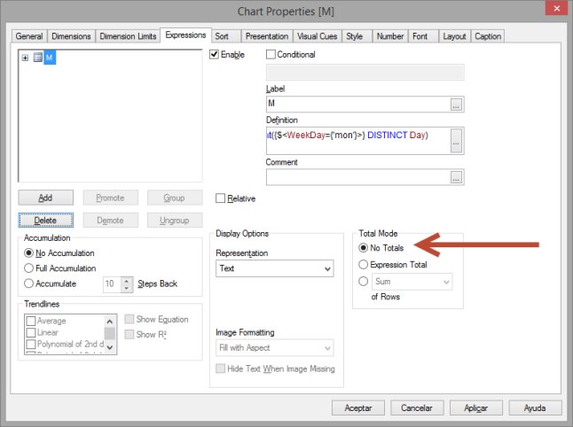
3.- In this object, we are going to create two expressions for every day of the week: “Day” and “Sales”. We will start with “Day” column for Mondays:
Use ‘M’ as label and select No Totals in the Total Mode.
Open the menu in this expression to change its Background Color and Text Format:
4.- Create a new expression for the sales amount:
Use a space as label (just to hide the expression definition). Don’t forget to choose the Money format in the Numbers tab.
Your table should look like this:
5.- Copy and paste these columns 6 times and change the filter in the Set Analysis clause to visualize the corresponding day.
6.- Now let’s create the “Week Total” column by creating this expression:
And its corresponding sales amount:
After these steps, the structure should be ready. However, we still need to make some visual adjustments.
7.- In the Presentation tab:
- Center the labels for every column
- Select the Week dimension and hide it
- Totals on last row
- Wrap header and cell text (2 lines)
If you want to get rid of the zeros, you can use an IF statement like this:
If anyone has a better way to do this, please share! I feel like it’s a little dirty to use these kind of expressions ?
8.- Voilà, our calendar view is ready.
You can complement it with a Calculation Condition, a friendly error message or the Always One Selected Value option in the MonthName field.
If you have any comments or suggestions remember to post them in the section below!


![[PowerBI][DAX] – SUMX() power bi dax fonctionne sumx](https://i1.wp.com/mybicoach.bwabwanet.fr/wp-content/uploads/2020/03/powerbi-dax-sumx.png?resize=100%2C70)


![[PowerBI][DAX] – Comment créer des cartes dynamiques et intelligentes ? carte intelligente et dynamique](https://i0.wp.com/mybicoach.bwabwanet.fr/wp-content/uploads/2020/03/powerbi-carte-intelligente.gif?resize=100%2C70)


![[PowerBI][DAX] – Comment compter le nombre de ligne d’une table ?](https://i2.wp.com/mybicoach.bwabwanet.fr/wp-content/uploads/2020/01/powerbi-dax-countrows-logo-1.png?resize=100%2C70)
![[PowerBI] – Comment obtenir la date de mise à jour du rapport ?](https://i0.wp.com/mybicoach.bwabwanet.fr/wp-content/uploads/2020/03/powerbi-lastupdate-miseajour-item.png?resize=100%2C70)